
Menomorphosis Brand
You know how getting older can feel like ‘it’s all downhill’? Well this beautiful brand is taking the ‘taboo’ out of menopause and the 10 years leading up to it, also know as perimenopause. They exist to help women in their 40’s feel optimistic about aging…like they’re not growing old, just growing (and evolving).
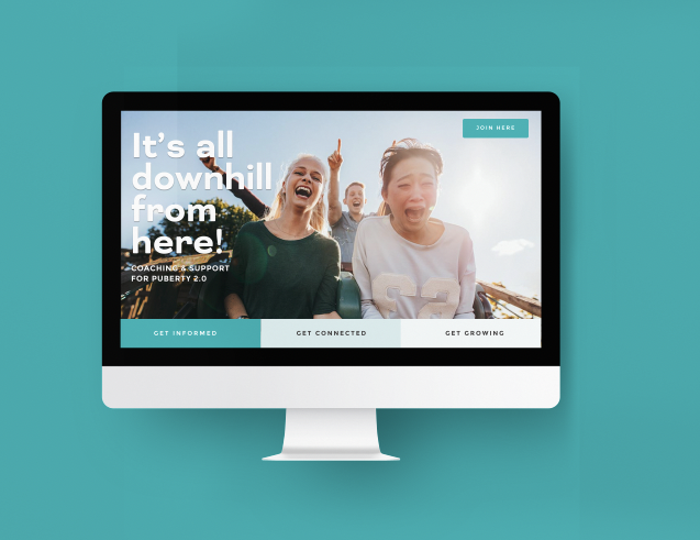
It’s Puberty 2.0.
Perimenopause is just another one of life’s growth spurts. Only this time we’re wiser, more knowledgeable, and more prepared. We get to grow in the way we want and shape and influence the way we age.
Puberty 2.0: the next stage of freedom!


-
Most women struggling with perimenopause don’t even know it’s a thing. We needed to find a relatable way of introducing it and connecting to the right audience.
-
You’re not growing old, just growing. Welcome to Puberty 2.0.!
Puberty is all about growth and transformation. It’s scary and exciting but we all get to reshape who we are though it. However, most of us go through it without a lot of guidance or support.
Like puberty, the years leading up to menopause can feel like a struggle women have go through behind closed doors. It comes with a lot of negative emotions and shame.
We believe aging isn’t something we have to worry about. It’s not something that happens after our 30’s. It started the day we were born. The more we resist it, the less we can shape it, influence it, slow it down. We can’t change the fact but we can influence the rate. And help ourselves age better. By knowing what to do. And shifting our perspective
We help women in their 40’s embrace, empower, and thrive through perimenopause by helping them feel youthful and ready to grow!
-
• Coming in 2023!
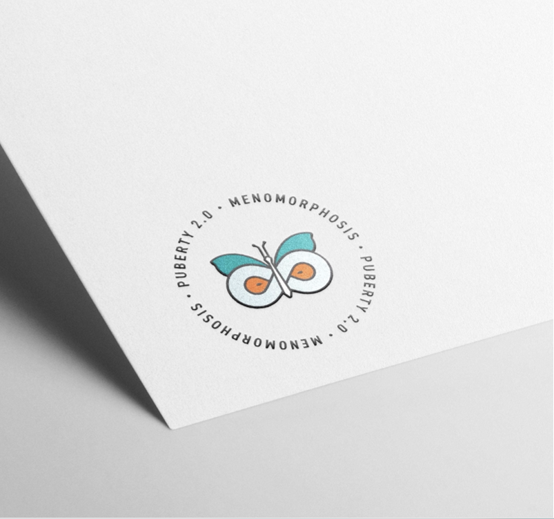
The logo.
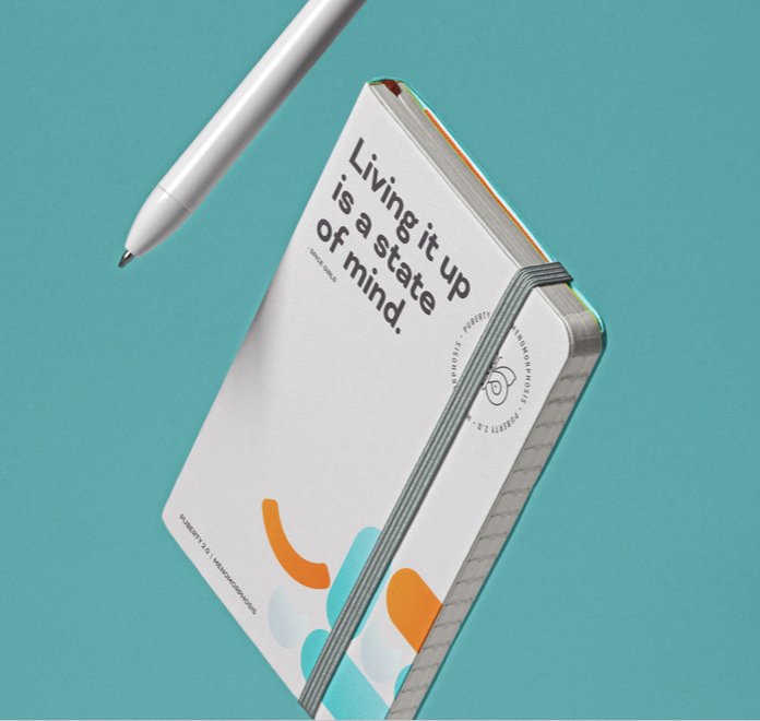
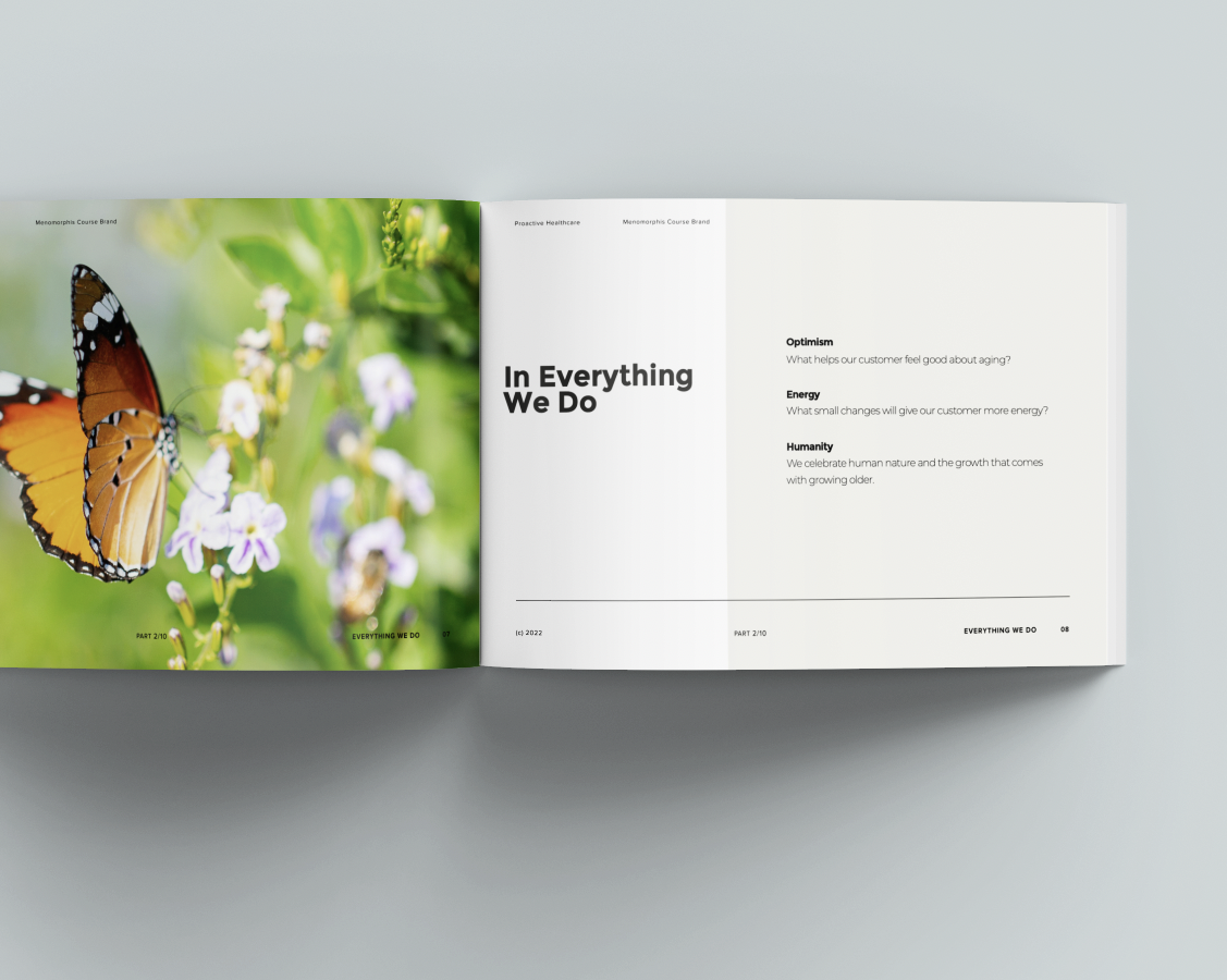
Why a butterfly? Because it represents transformation (just like perimenopause). We can imagine puberty as the cacoon phase, perimenopause the transformation phase, and menopause the butterfly phase. The Menomorphosis brand is about supporting women through the years leading up to menopause and embracing the freedom that comes with it.


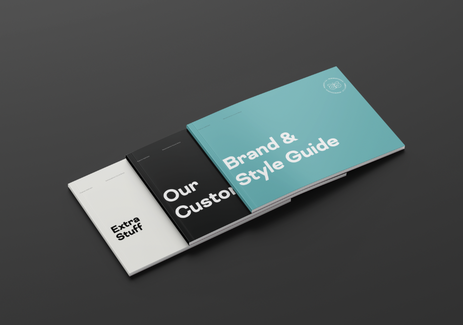
Project Details.
Brand Strategy
Logo Design
Brand Guide
Style Guide
Marketing Support
The Team.

CORTNEY WALKER
Brand Strategist
& Designer
Project Reviews.
-

"The whole process was amazing, inspiring and essential in a way I didn't expect. Every business needs to do this.
Dr. Natasha Zajmalowski ND, CEO